

The first impulse when selecting interior colours for a new building is to go neutral. Not only do neutrals such as white, grey and beige go with everything, most people find them pleasing to the eye – which is important if your building is a public space.
However, let’s just say it, neutral is kind of boring!
Certainly, neutrals are great in certain applications and also compliment a more colourful scheme, but if you want a happiness-inducing home, office, store, library, school, restaurant, recreation centre – and so on! – then these six mood-boosting shades are the way to go.
Check out our Pricing Guide HERE
Red

A bold choice, right out of the gates, and one that makes quite the statement. The colour red is associated with energy and will add zing to your building’s interior. Interestingly, a British study found that evenly-matched Olympic athletes with red uniforms outperformed those in blue.
That being said, if red on the walls just seems like too much, try red accents in the form of furniture, artwork and accessories.
Yellow

Photo Credit: Wikimedia
Much more mellow than the previous colour choice, yellow is about as happy as a colour can get. We associate yellow with sunshine and summer fields, no wonder it makes us smile!
Use this much-loved shade in unexpected places, such as on architectural features or on the ceiling. Leaving the walls neutral will allow the ceiling to pop and make a space feel like it’s cast in a warm glow.
Blue

Photo Credit: Wikimedia
According to the website Live Science, 42% of men and 29% of women list blue as their favourite colour. Just as yellow makes us think of sunshine, the colour blue reminds us of a clear sky and the ocean – two very calming elements.
Another study showed people faced with anxiety-inducing tasks felt less stressed after they were exposed to the colour blue.
Purple

Photo Credit: K2 Space on Flickr, under Creative Commons
The same Live Science study found purple to be the second favourite colour among women. Purple actually has a similar impact on mood as red does, but is often thought of as a more regal colour thanks to its association with royalty.
You may want to avoid using purple – or red for that matter – in areas of your building you’d like to have a calming vibe and save it for areas where you’d like to infuse energy.
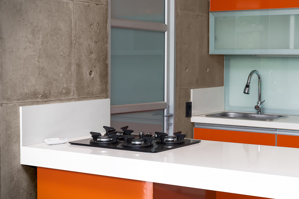
Orange

Photo Credit: Pxhere
Both daring and playful, orange certainly makes a statement in any interior space. Orange adds a fresh feeling to a room and brings out a childlike sense of fun. To break up the colour’s intensity, pair it with white accessories. Or, add just a pop of playfulness with a single orange wall or orange cabinets.
Green

Soft green, forest green, apple green – no matter the shade, green is a favourite in the realm of design. Thought to bring balance and harmony to its surroundings, green is associated with the outdoors and has a way of making indoor spaces feel infused with the same soothing sense of the natural world.

_(35350359953).jpg)
_office_furniture.png)
Take a look at our wide range of colours HERE and start boosting your mood!